Join me on Facebook!

Wednesday, February 27, 2008

metaphors ~


Empty Nest, 6x6" Oil on canvas


Yes, this represents something personal. As I contemplate the fact that my kids are growing up, it seemed rather appropriate to use a metaphor to explain it. Of course, the feelings that this place in life inspires are as tangled and interwoven as the nest itself... For awhile, it is not entirely empty - but without looking forward too far in time, it is easy to see that it will soon be empty indeed. What will that mean? Time will tell.

Tuesday, February 26, 2008

Once again...


Cat Nap, 4.25 x 5.5" watercolor/ink on paper

Back by popular demand! Another cat painting. I'm considering the future of these small cat paintings - already a set of notecards are available.
Perhaps a calendar in the future? I'll keep you posted!


Saturday, February 23, 2008

An inside look


Yellow Floral, 7.25 x 5.75" Watercolor/acrylic on paper

Being completely disenchanted with winter - longing for spring to arrive - I purchased a small gathering of flowers at the grocery store this past week. This flower, very delicate - speckled - was almost lost in the profusion of carnations and mums. I was intrigued by the lovely swooping stigma and stamens, the intense yet delicate colors, and how the inside of the flower gracefully spilled out ward. The speckles attract our attention and draw the eye into the deeper recesses where the color becomes even more interesting. This painting is a first study and as I return to it to work on this subject again, I will probably exaggerate and abstract the shapes.


Wednesday, February 20, 2008

The other thing!


10" wooden bowl - mixed media

This is the finished commission I mentioned earlier in the week. Yes - there is a glare. The concave surface is extremely difficult to photograph... I do best outside in natural daylight - but, with a windy below zero, snowy climate right now - going outside for any reason is to be avoided! This will be going to someone who is retiring from a 16 year coaching position.


Friday, February 15, 2008

Belated valentine!

Berry Bowl, 6x6" oil on canvas

SOLD

Belatedly, I'm posting a valentine because it was too wet to scan yesterday. Clearly, I am attracted to strawberries this winter!

Below, I have posted an image of just getting started on this painting. As you can see, I toned the canvas first with a golden yellow. Not much (if any) shows through on the final painting - however it may give a warmish tone to the painting in places - especially the berries. I drew the set up in very light washes of color... that is the purple and blue you can see in places. Also, I used many transparent colors - on the berries in particular... I like the dimension of color that gives as that area gets built, layer upon layer. (On these steps, I used liquin to give a bit more transparency and speed the drying.) My final steps involved deepening the values, especially on the berries and in the shadows behind and around the berries, and working on shadows.
The last step was to add some highlights. They look pretty white here - but in fact the color I mixed was a definite yellowish hue. BTW, the berries were as good as they looked! I ate them at lunch today :)


Early progress on Berry Bowl

Thursday, February 14, 2008

Multi-tasking week!


Pelican - Scratchboard - 8x10"

It has been a busy week - thus my poor posting this week. At the moment, paint is drying, so I'll be posting a new painting shortly. But I've also been working on a commission this week, and I've been experimenting a bit with some ideas I'm revisiting from several years back... a sort of mixed media endeavor with paint/mylar/and graphite. I hope to post some of those explorations soon.

In the meantime, this is a scratchboard drawing, done as an example for my students. Working with scratchboard is a lot of fun - although some types of board are much better than others! Also some styluses are much better than others. My favorite stylus is actually an exacto knife with a new blade. Once you allow yourself to think in the negative, the scratchboard drawing comes together much like other types of drawing.

Tuesday, February 5, 2008

A Ray of Hope


Snowscape - Dawn, 8x8" Oil on canvas

SOLD
 
The midwest has been hit many times this season with snow... much more than we've had in recent years. Another storm is due to arrive this evening. (more shoveling!) So, in honor of this fact and the fact that snow is about all that can be seen, this painting depicts fields of snow with the play of light across the expanse. The play of light is what is important to this scene. In a way, a ray of hope!


Monday, February 4, 2008

Squidoo

I've just created a squidoo lens! On it, I've included a link to a book that I've found useful,
Creating a Life Worth Living, by Carol Lloyd. It is written especially for those of us who are artistic or entrepreneurial and are searching for a more creative way of life! Also, toward the bottom of the page, I've begun a chapter by chapter overview.

Check it out: http://www.squidoo.com/HelenCRead
Favorite it! I'll be adding to it and changing things from time to time.

Friday, February 1, 2008

Virtual Garden


Hosta in Bloom, 7 x 7.5" watercolor/acrylic on paper

Last night, we got about 8" of additional snow. This morning, after the subsequent shoveling, I'm feeling ready for some green and some lushness ... not that the snow isn't beautiful - but I'm a warm weather kind of girl! I really miss my garden in late January and early February!

I started this painting a few days ago - it has been awhile since I worked in water color. I started with water color then finished up with acrylic used as a water media. It is done on 300 lb. water color paper. This came from a photo I did in the summer in my front garden. This particular hosta is large and very beautiful in bloom. Today - I'm looking forward to June when it is back in bloom!


Monday, January 28, 2008

And here is the postcard ~

This is the rest of the weekend work I did on advertising materials. This is a small postcard - the other side has pertinent contact information. I am not sure how or if this will be useful for creating a greater presence and building knowledge about what I'm doing. Time will tell, but I think it is worth a try!

The Business Card has arrived!

There is more to building a presence in art than just the paintings... although you don't have much without that component! This weekend I spent a lot of time working on my business card. It has been on my "list of things to do" for several months! I wanted something that was representative and memorable - visually interesting - and I really just hadn't had the time to devote to the development of the ideas. Yesterday, I finished the business card. This is side 1 - side 2 has pertinent information about how to contact me and what I do. It is printed on a grainy oatmeal card stock. All in all, I'm pleased with the outcome.

I am also finishing work on a postcard to be mailed to friends/acquaintances who are not aware of what I'm doing artistically. I'll post that in the next few days.

I love crossing off a lingering item on my list!

Friday, January 25, 2008

A Red Head


A Red Head, 5 x 7" Oil on canvas


The interior of a cabbage is very intricate and quite abstract! The outer leaves are equally interesting in their color and how the light plays along the head of the cabbage. In this painting, I could only capture the suggestion of what is going on inside the head - but I love the abstract shapes and the contrasting colors between the light rib interiors and the reddish purple into bluish purple of the leaf areas.

The picture below shows step one. In this case I did not tone the canvas first. I was interested in keeping the lightest areas pretty white. I like phase I of this painting - it almost resembles a water color, although it was done with light washes on the stretched canvas. After that dried, I then went back with thicker paint and liquin to achieve the more detailed parts.

Tuesday, January 22, 2008

A Tete-a-tete ~

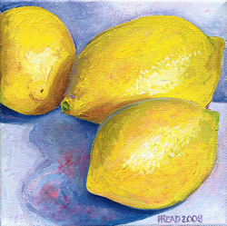
Three Lemons, 6x6" Oil on Canvas

SOLD
 
This is the first still life of the new year for me. I wanted to focus on the underpainting being a warm, vibrant color - to add a sense of warmth to the 3 yellow lemons. I was so captivated by the undertone showing through in places, I wanted to leave it there plainly. As you can see, the underpainting is a very dark rose color. It show through in some of the shadow areas as well as through the skin of the lemons. There are also undertones of green in the lemons. Some of the shadowed areas were quite warm, and other areas were much cooler in color. The stroke marks are visible and with the broken application of color, this painting has an overall impressionistic feel to it.

My title isn't too original - but, as I looked at it, it seemed as if the 3 lemons could be deep in conversation!

Oh - one more thing - I just noticed that this posting makes my 100th post since starting my blog in July. As you can see, it isn't a daily thing - but almost! Thanks to those of you who come by for a visit often... you make this very worthwhile!


Related Posts Plugin for WordPress, Blogger...