________________________________________________

I'm starting with a 9x11" stretched canvas. My first step is to tone the canvas so that I don't have a stark white canvas. I've chosen a light violet to use for this step - though many different colors could be used. I try to smooth it so that I have an evenly toned canvas as it dries.
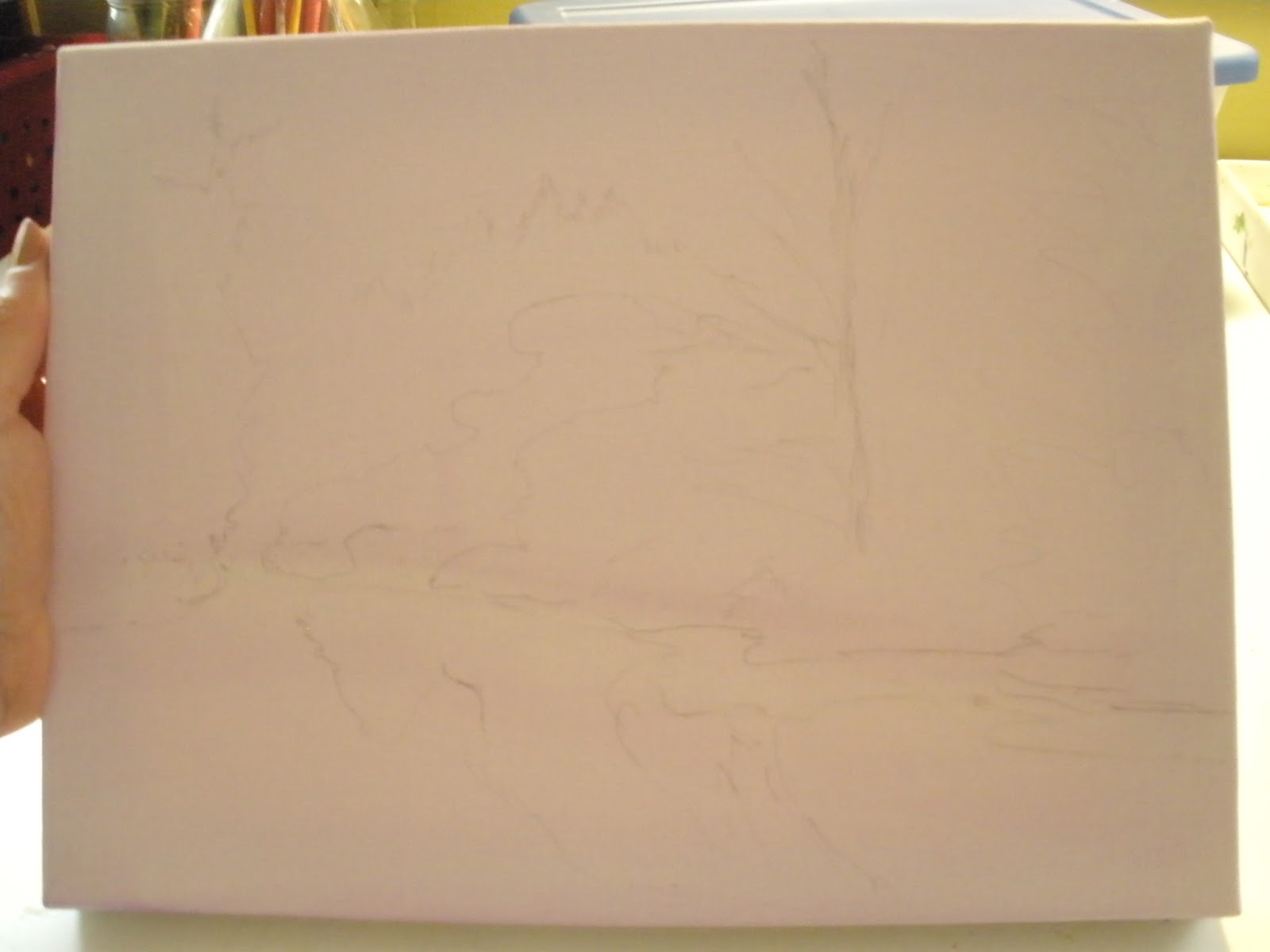
Its a little hard to see here, which is the point! Using the reference picture I've chosen, I do a very light sketch on the canvas - mostly just putting in the larger shapes. This was done with a very fine tipped pencil. You don't want a heavy graphite line which will smear and blend with the oil paints.
Sometimes, I use a thin wash of paint to do the same thing.
 One of the most important aspects of a painting is value. Its important to establish where the dark areas need to be and where the light areas need to be. This shows those early brushstrokes, which are done in ultramarine blue and done in a light wash.
 This shot shows a little bit more of where I've placed the darker values. And, I'm also beginning to add the color of the sky. This is just the first pass at the sky. If you have the opportunity to look at the sky and really notice the change in color, you will see that on a clean (non-humid) day, the sky is deeper in color as it ascends and less color is typical as it approaches the horizon. The change is subtle, but its there.
My reference picture has clouds, but I decided to eliminate them and go with a clear sky.
 I often use a fan brush to create a more even distribution of paint.
 You can see something of the way the sky color subtly changes here.
 Next, I'm starting to add some of the local color and I'm paying attention to the values. I want to put in the darker values and be sure to adjust them with the other colors. There's a lot of green in this painting - and I want to be sure that my greens have variety. In order to tone down some of the acidic greens that are often seen straight from the tube, and are not natural at all - I mix with a variety of colors. Here I've used Chrome Green, and added at times some Ochre, or some Ultramarine blue, or some Alizarin Crimson, or even some violet. To brighten it in the few brighter spots, I've added some Hansa Yellow and possibly some Ochre too.
 I've begin adding addition shapes. I also want to pay attention to the direction that the light is shining in this image. Capturing the light correctly gives a great deal of believability to the picture you create. More adjustment will be needed as I continue.
 I've made more progress here, showing more than just the green in the picture. This picture (which I took in the spring), has a beautiful grouping of redbud trees in full bloom. I've started adding in that color now, but more adjustment of values and color will be needed as I proceed.
 Now - the reflective water needs to be painted. The main thing to notice is that the colors are mirrored and the shapes are mirrored in the water. But, the water produces a softer edge to shapes and colors.
 The reflective water is now basically finished. I also have gone back to heighten the darker values, particularly at the waterline.
The color shown here is not particularly true because of the lighting I used as I worked.
The painting is now finished and drying. I'll post the final scan in a day or two when its dry!
For those who wonder what the process might entail, I hope this gives a little insight into how a landscape is created using oil paints and a reference picture.


My reference picture has clouds, but I decided to eliminate them and go with a clear sky.


The color shown here is not particularly true because of the lighting I used as I worked.
The painting is now finished and drying. I'll post the final scan in a day or two when its dry!
For those who wonder what the process might entail, I hope this gives a little insight into how a landscape is created using oil paints and a reference picture.
1 comment:
Oh great, thanks for sharing that. Michelle
Post a Comment