
Friday, August 30, 2013
Thursday, August 22, 2013
Newly Redesigned Website!

Please visit my newly "remodeled" website! Take a few minutes and look around;
its easy to navigate... I'm still in the process of learning all that is available to me there, and I'm uploading photos.
I'm looking forward to continuing to make it more interesting and useful to collectors as well as adding things to interest other artists.
Here's the link: HelenCRead.com
Please leave me your comments in the "contact the artist" section. I'd love to hear you opinions and any suggestions you might have to make it even better!
Tuesday, August 20, 2013
A landscape & architectural structure!

Tunkhannock Viaduct, 9x12" Oil on canvas
© Helen Read
framed in cherry frame - ready to hang
(Domestic shipping included, IL residents please add 8% sales tax)
In
this painting, I hoped to capture the grandeur of a landscape with
man-made architecture in it. The lighting and the magnificence of the
structure were of equal interest to my eye. © Helen Read
framed in cherry frame - ready to hang
(Domestic shipping included, IL residents please add 8% sales tax)
I happened, very
unexpectedly, upon this scene traveling through northeastern PA - and
was completely captured by the beauty of craftsmanship and creation!
Friday, August 16, 2013
More progress on my newest painting
Progress Continues!

The next few steps are shown here. I've started putting in a little more substance to the bridge and a few spots of shady green below. You can start to see a little more of he light and how that is affecting the colors.

Even more work has happened on the bridge here!
I'll be posting more in the next few days. I hope to have the final version soon thereafter!
Tuesday, August 13, 2013
First steps - a new painting
.jpg)
I've just gotten a step or two done here - this will be a new 9x12" oil - It will be a landscape, though right now, it looks much more architectural. I started with a careful drawing of the structure (which is the Tuckhannok Viaduct - from a reference picture I took in NE Pennsylvania). The structure is amazing to see - extremely tall. I hope to capture its grandeur. And below it is a wild growth of foliage and rather tall trees. I was particularly captivated by its beauty and grace ... a lovely reminder of what went into construction 100 years ago.
I'll be posting pictures of the progress! Keep watching!
Friday, August 9, 2013
Etsy! A variety of items available.....

Come visit my Etsy site!
I've just added items after a studio cleaning!
Wednesday, August 7, 2013
Abundance

Abundance, 9x12" Oil on canvas
©2013 Helen Read
I named this painting Abundance because the scene from which I painted this was overflowing with blossoms and foliage and -- well, life!
As I looked over the pond in the foreground, the flowering trees seemed
to cascade toward the water and then the rose color spread toward me.
All of it, even the scrubby parts of the shore were lovely.
It was as if the beauty and the life of the woodlands could not be contained!
Another look - making an abstract painting

Spirit, 22 x 30" Acrylic on Paper
©2010 Helen Read
(in its final form)
(in its final form)
This is the first video I've made about the process of making this larger abstract painting. While it shows my process, it is visual only. Take a couple minutes to watch it! I think you'll find it interesting and also perhaps it will bring you a few minutes of relaxation and - joy!
Tuesday, August 6, 2013
Creating a landscape - my process:
Before anything else, I make preliminary sketches working out the composition and the value structure of the painting I plan to do. I haven't shown that part of the process here - perhaps that will be a separate post!


________________________________________________

I'm starting with a 9x11" stretched canvas. My first step is to tone the canvas so that I don't have a stark white canvas. I've chosen a light violet to use for this step - though many different colors could be used. I try to smooth it so that I have an evenly toned canvas as it dries.
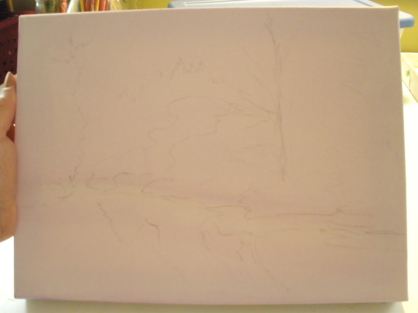
Its a little hard to see here, which is the point! Using the reference picture I've chosen, I do a very light sketch on the canvas - mostly just putting in the larger shapes. This was done with a very fine tipped pencil. You don't want a heavy graphite line which will smear and blend with the oil paints.
Sometimes, I use a thin wash of paint to do the same thing.
 One of the most important aspects of a painting is value. Its important to establish where the dark areas need to be and where the light areas need to be. This shows those early brushstrokes, which are done in ultramarine blue and done in a light wash.
 This shot shows a little bit more of where I've placed the darker values. And, I'm also beginning to add the color of the sky. This is just the first pass at the sky. If you have the opportunity to look at the sky and really notice the change in color, you will see that on a clean (non-humid) day, the sky is deeper in color as it ascends and less color is typical as it approaches the horizon. The change is subtle, but its there.
My reference picture has clouds, but I decided to eliminate them and go with a clear sky.
 I often use a fan brush to create a more even distribution of paint.
 You can see something of the way the sky color subtly changes here.
 Next, I'm starting to add some of the local color and I'm paying attention to the values. I want to put in the darker values and be sure to adjust them with the other colors. There's a lot of green in this painting - and I want to be sure that my greens have variety. In order to tone down some of the acidic greens that are often seen straight from the tube, and are not natural at all - I mix with a variety of colors. Here I've used Chrome Green, and added at times some Ochre, or some Ultramarine blue, or some Alizarin Crimson, or even some violet. To brighten it in the few brighter spots, I've added some Hansa Yellow and possibly some Ochre too.
 I've begin adding addition shapes. I also want to pay attention to the direction that the light is shining in this image. Capturing the light correctly gives a great deal of believability to the picture you create. More adjustment will be needed as I continue.
 I've made more progress here, showing more than just the green in the picture. This picture (which I took in the spring), has a beautiful grouping of redbud trees in full bloom. I've started adding in that color now, but more adjustment of values and color will be needed as I proceed.
 Now - the reflective water needs to be painted. The main thing to notice is that the colors are mirrored and the shapes are mirrored in the water. But, the water produces a softer edge to shapes and colors.
 The reflective water is now basically finished. I also have gone back to heighten the darker values, particularly at the waterline.
The color shown here is not particularly true because of the lighting I used as I worked.
The painting is now finished and drying. I'll post the final scan in a day or two when its dry!
For those who wonder what the process might entail, I hope this gives a little insight into how a landscape is created using oil paints and a reference picture.


My reference picture has clouds, but I decided to eliminate them and go with a clear sky.


The color shown here is not particularly true because of the lighting I used as I worked.
The painting is now finished and drying. I'll post the final scan in a day or two when its dry!
For those who wonder what the process might entail, I hope this gives a little insight into how a landscape is created using oil paints and a reference picture.
Sunday, August 4, 2013
A new work in progress

9x11" Oil on canvas
Whew.... the wedding is over now - as wonderful as it all was and as much as I loved every minute, there was little time for anything else! So, now that all the planning, making, errands, showers, inviting, organizing, etc - and then sending the couple off together - is done, I'm back in my studio. It seems like a long while since I've been able to just work on art! I'm glad to be back at it again.
Thursday, August 1, 2013
Its been quite a (few) week(s)
Just a few days ago, we celebrated my daughter's wedding! What a wonderful day and celebration!
As you can guess, this meant a house filled with family and friends, much preparation and activity, a large gathering for the ceremony and a joyous reception for about 200. I haven't been in my studio much just lately.... but things are settling down. I hope to be back at the easel very soon. In the meantime, I'm posting some things from the archives!

As you can guess, this meant a house filled with family and friends, much preparation and activity, a large gathering for the ceremony and a joyous reception for about 200. I haven't been in my studio much just lately.... but things are settling down. I hope to be back at the easel very soon. In the meantime, I'm posting some things from the archives!

Orange Flower II, 7x7" Watercolor/acrylic on Yupo
© Helen Read
ready to mat and frame
This  little painting was done just a year ago. It's still available. I painted it from a photo I took of a small orange flower while on a hike in NY. I had never seen it before, but after some research, I believe it is Jewelweed. I liked the way the watercolor took to the Yupo paper... It is a very smooth paper and there is almost no absorption, so the paint moves very freely around ~ mixing, blending, drying unevenly. Overall, it gives a very painterly and somewhat unpredictable effect!
Subscribe to:
Posts (Atom)
